When an image and monitor have different proportions, either cropping or empty space is unavoidable unless the picture is distorted. The right fit mode protects the important subject while keeping the wider composition intentional.
Compare cropping and empty space with a 16:9 photo on 4:3
Prepare
Use a 1920×1080 photo as an example. The figures below assume a centered background at 100% zoom; gallery-specific 4:3 artwork can have a different composition.
Steps
- Set a new project to 4:3 and use the same photo as its background. Note subjects near the left and right edges.
- Fill leaves no empty area but crops the sides. In a 1440×1080 target, 240 source pixels disappear from each side.
- Fit shows the full source at 1440×810, leaving 135px above and below. Fit + blurred fill uses an enlarged, blurred background to fill that space.
- Keep the clock away from crop boundaries and check again at 16:9. Editor zoom changes the workspace view; it does not increase output resolution.
Check the result
Choose Fit when preserving the whole subject matters most, or Fill when edge cropping is acceptable and you want no empty space.
If the result differs
If the diagram does not match, check background zoom and position. Gallery ratio variants may use different artwork; verify the final result on the intended monitor in fullscreen.
How much will fit on your screen?
Enter image and monitor dimensions in pixels to compare Fill and Fit. Calculations stay in your browser; no upload is needed.
Fill
- Rendered size
- 1820.4 × 1024 px
- Crop per edge (left/right / top/bottom)
- 270.2 / 0 px
- Original area visible
- 70.3%
Fit
- Rendered size
- 1280 × 720 px
- Gap per edge (left/right / top/bottom)
- 0 / 152 px
- Original area visible
- 100%
Example: the café image is stretched to the entered ratio. This is not a preview of your own image.
Assumes centered placement without rotation or extra zoom. Crops and gaps use screen pixels. This does not detect your monitor or improve image quality. Choose Fit to preserve subjects near the edges.
Example 2 · Adapt the same café background to 4:3
Duplicate the first example and compare Fill with Fit using the same image. Do not substitute the separate 4:3 artwork: the point is to see what the fit modes change.
Authentic Korean Studio screenshots captured in desktop Chrome on 2026-09-19. The captured clock time is not fixed; it updates live. Use the translated instructions alongside the Korean UI in the images.
Reproduction settings
- Canvas
- 4:3 · 1600 × 1200
- Clock center and width
- X 400 / Y 480 / W 560 px
- Background scale and position
- 100% · X 50% / Y 50%
Steps
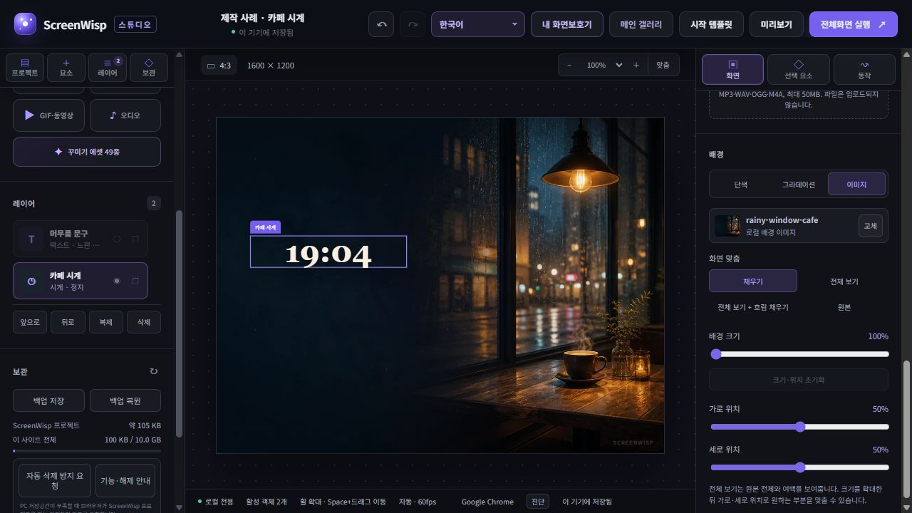
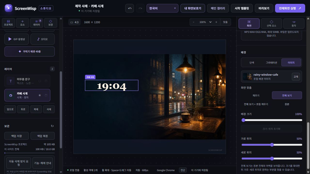
- Duplicate the project to preserve the original, then select 4:3. Studio uses a 1600×1200 reference canvas. Keep the background at 100% scale and 50% horizontal/vertical position.
- Fill covers the canvas but crops the left and right edges. Choose it when an edge-to-edge background matters more than preserving objects near the photo edges.
- Fit shows the whole photo with space above and below, about 150px per side on this reference canvas. Compare Fit + blurred fill separately if you want the complete photo with a blurred background in the gaps.
Check the result
The clock keeps its relative placement: X 400, Y 480, W 560. Changing fit modes does not preserve the distance between photographed objects and the clock, so check again. These are editor captures; verify final fullscreen on your actual monitor too.
Why does the composition change between displays?
1920×1080 and 2560×1440 are both 16:9, so they can share a composition even though their resolution differs. A 1920×1200 display is taller at 16:10, while 3440×1440 is much wider at 21:9. Filling every one with the same undistorted image crops different edges.
Cover, contain, blurred fill, and original size
- Cover fills the entire display but may crop image edges.
- Contain shows the full image but can leave horizontal or vertical space.
- Contain with blurred fill places the full original over a soft enlargement of the same image.
- Original size uses the source pixel dimensions, so a small file may occupy only part of the screen.
Build a safe composition for several ratios
Keep clocks, text, faces, and other essential subjects within a central safe area. Leave edge regions that can extend or crop without changing the meaning. A dedicated 21:9 source remains the most natural option when ultrawide presentation matters.
Image screensavers use prepared aspect-ratio variants and element layouts for the display area. Some ratios without a matching variant use the full image with blurred fill; edges may still be cropped depending on the ratio and composition.
Test several ratios on one monitor
- Choose the current display or a 16:9, 16:10, 21:9, 4:3 or 9:16 canvas.
- Zoom out to inspect clipping and off-canvas motion points together.
- Adjust fit mode and position where text or subjects move too close to an edge.
- Finish with a real fullscreen test on the monitor you intend to use.
Try the workflow instead of only reading about it
ScreenWisp lets you create and preview a fullscreen display inside the browser without an account or a media upload.
Create in Studio ↗